


In the midst of all this U. S. political turmoil, the continuing wars in Ukraine and Gaza, and long days of heat advisories, I turned off the news and “played” with making a new logo for myself.
Trivial…unimportant in the scheme of things. I know. I know.
However, by working on this project I managed to survive another week without going mad, so I’m not apologetic.
What do you think? This red circle with black text was the one most people liked (with reservations). So I revamped it, using their suggestions.
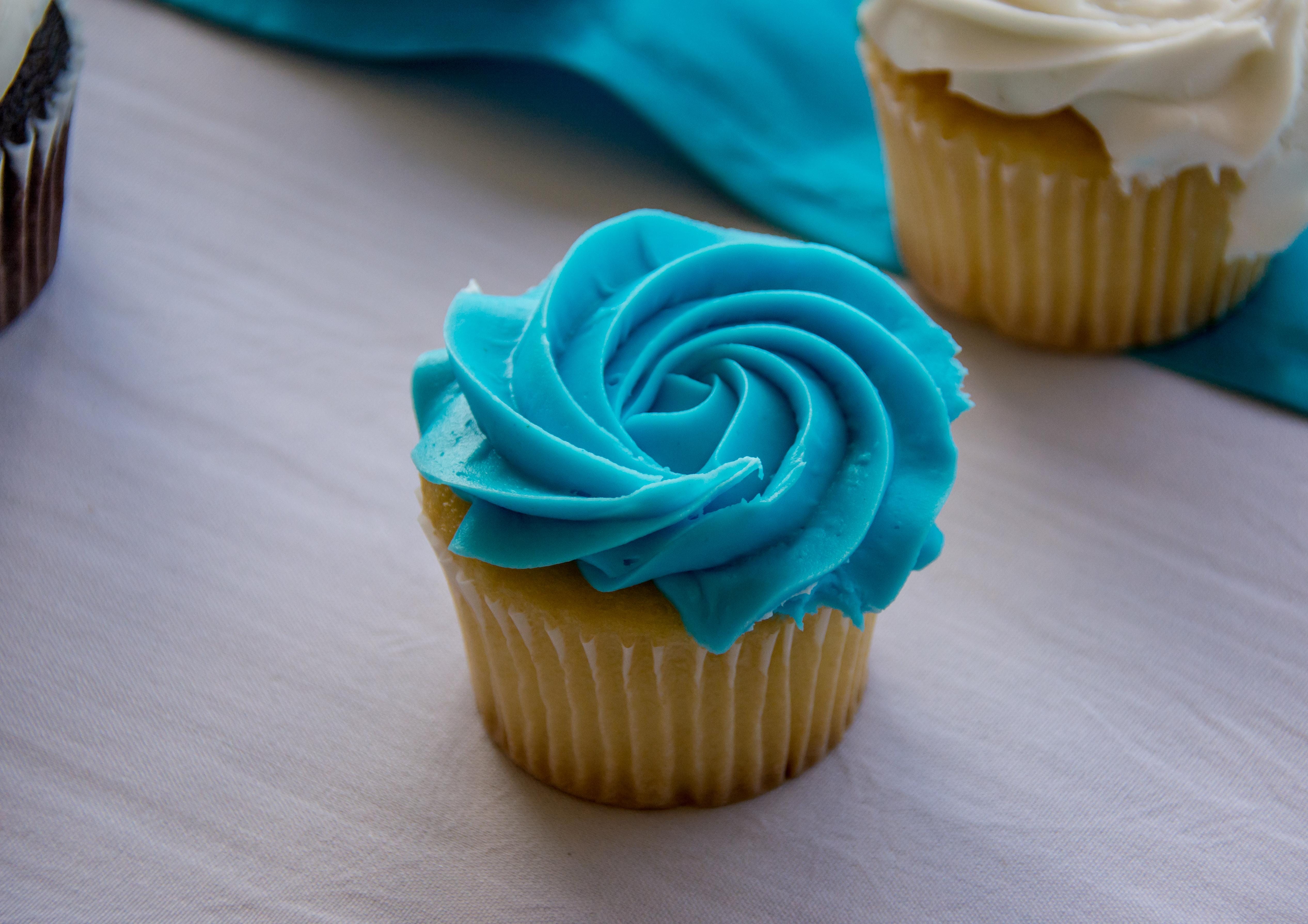
Another item of business that I tried to fix this week was the pop-up at the beginning of any Substack post I published. I didn't know that was happening since I don’t see what readers see. I hope I’ve changed the settings to stop those things. I’d appreciate it if you’d let me know. I dislike pop-ups as much as I dislike blue food. I don’t want pop-ups on posts I publish, and I don’t want blue food on my plate. Just in case you wanted to send me a blue frosted cupcake.
The logo looks nice. I love it.
Looks great!